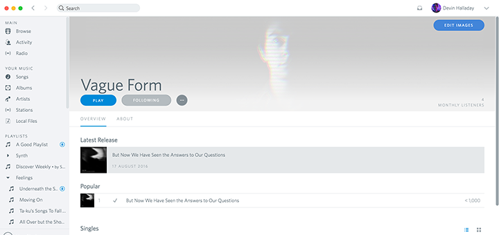
Here’s an interesting project we came across a couple of days ago. Devin Halladay — a designer and writer from Baltimore has crafted a complete visual overhaul of the Spotify Mac app that makes it look and feel more like the Rdio app — the music streaming service that Pandora acquired a few months ago. The Spotify app on Mac features only a Dark UI and while it looks great, this sure is an interesting way to theme it. Why exactly did Devin do this? Let him explain:
I sorely miss Rdio. It was the perfect music streaming service: quality streaming, massive selection, perfect UX, beautiful UI, and wonderful social interaction features. When it was bought by Pandora, many of us were left out in the dust and were forced to choose between lesser services like Apple Music, Spotify, and Google Play Music.
I know this little theme can’t recreate the amazing product that Rdio was, but I’m really glad that I found a small way to pay tribute to Rdio’s product and UI in my own way. This isn’t perfect, it isn’t Rdio, but as of now it’s the closest we’re going to get.
If you decided to go with Spotify but, like me, you miss Rdio’s light UI, you’re in luck—I discovered that you can skin the Spotify app with CSS.
You can check out the project, download it and even contribute towards it via Github. Remember though, this is still a very hacky way of doing this, so things will break.
