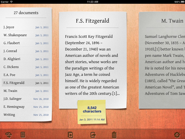
I published a review on SA when Writings for iPad first showed up. My one complaint:
The only thing I didn’t like about the app, was how it presents documents. It’s got this cartoony wooden UI, where each document takes up a whole screen. That probably emphasises that this an app for longer articles, but it’s kind of a slow UI.
The developers then asked if I wanted to test the 1.1, which has a new document list feature. I figured it would be some kind of pop-over iOS list, so I declined. What I didn’t anticipate, was the list looking so gorgeous, totally blending with the already established user interface. You can hide the list if you don’t want it, but leaving it visible is the best possible UI for this app.
The overall UI still emphasises that the app is meant for longer articles rather than small snippets of text, but it’s now much faster at navigation. I had actually intended on featuring Writings on BP on its day of release, but it slipped my mind until it was too late. I was looking for an excuse to post it, and I couldn’t have asked for a better 1.1.
The tl;dr of Writings: a Dropbox syncing writing tool for the iPad, with interesting UI gestures for moving the text cursor, distraction free writing environment, and a beautiful UI. For the record, I use Writings for my longer pieces, and PlainText for everything else. $4.99 at the App Store.
