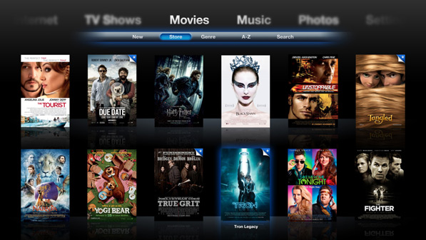
Zach Forrester, the guy who mocked up a 3D Mission Control UI when Lion was announced, takes yet another stab at Apple’s user interfaces — Front Row.
Before I go any further, I’ll say that designing Media Center interfaces can let the imagination run a little too wild. On the one hand you can make them highly interactive, vibrant, and delicious looking interfaces, but at the same time make sure that it’s all logical, fast, and easy to understand. Take for instance Plex, which is a great media center app, but a little difficult to get around for someone who doesn’t know how to use it. That said, Front Row is surely due for a visual refresh, especially with the AppleTV sporting a wildly different UI. Back to Zach’s design…
Zach has made some interesting choices, especially the UI for browsing music. Not sure about how well it would translate in real world usage, but it certainly looks tempting. I’m don’t think the keyboard will work with the hardware remote (doesn’t have a clickwheel). Also, the whole presentation could have used a little more polish.
So, yay or nay? Let @beautifulpixels and @zforrester know what you think.
