[tweetmeme]”Don’t play with the defaults”, people say. It confuses the users by adding complexity, where simplicity will do just fine. But then, there’s “Think Different”. In this crowded internet space, your site needs to stand out from the mundane. If you know you can do something better, why not go the extra mile?
When I first saw Tim Van Damme’s blog, the scrollbar immediately got my attention. It was a regular [well designed] site, but with a revamped scrollbar totally fitting with his content. And I wanted that. As always, when curious on the web, I fire up Safari’s web inspector and look around. Turns out, it’s a feature of Webkit that allows you to modify the scrollbar to anything you’d like. There’s a catch to this however: you can’t modify the main scrollbar. Webkit provides this features so you can easily style ugly scrollbars within frames, but you can’t stop smart hackers from making the best of it.
So how does Tim do it then? The trick is to get the default scrollbars not to show, so that the content will be wrapped in a frame of its own—thereby triggering the secondary scrollbar. All of this resides in the primary stylesheet. If you have a WordPress blog, it’s most probably called style.css and is placed within your template directory. For Tumblr blogs, go into Custom HTML mode, and enter/edit changes between the the <style> tags. Your first step, is to alter the body element. It needs to be positioned at 0 for the top, left, and bottom, but add a few pixels on the right so your scrollbar isn’t touching the edges. Another important aspect here, is to set the “overflow-y” style to ‘scroll’. This takes any content that the body couldn’t display within its given size, and puts it in a scrollbar. The body of your CSS document should read as:
body {
position: absolute;
top: 0;
left: 0;
bottom: 0;
right: 10px;
overflow-y: scroll;
overflow-x: hidden;
}
The second thing, and I don’t know why this happens, but you need to alter the style for html as well.
html {
overflow-y: auto;
background-color: transparent;
}
I don’t know why one needs to set the overflow-y to auto, but without it the new scrollbar doesn’t work properly, or at all. Setting the background-colour to transparent will better float the scrollbar, which would otherwise leave a white border on the right.
That should take care of your scrollbar, but wait, it looks the same?! That’s because you haven’t styled it yet. Here’s a walkthrough for each style element you need to add to your stylesheet:
::-webkit-scrollbar {
width: 10px;
height: 10px;
}
This is your entire scrollbar unit. Webkit-scrollbar accepts width and height for the scrollbar. One of the sides, in this case the height, will be fluid since it’s a vertical scrollbar. For best results, enter the same value for both.
::-webkit-scrollbar-button:start:decrement,
::-webkit-scrollbar-button:end:increment {
height: 30px;
display: block;
background-color: transparent;
}
This is the little button at the start and end of the scrollbar. You can style this as you would any other object. Width, height, background-color. Tim has made his completely transparent—rather the same colour as the document background, but you could even use a background image if you’d like. In the above example I’ve set the height at 30 pixels, so it makes the entire scrollbar appear as if floating within the page.
::-webkit-scrollbar-track-piece {
background-color: #3b3b3b;
-webkit-border-radius: 6px;
}
This is the thin background upon which your scrollbar moves in. The gutter. Background-colour, border-radius, or any other basic styling works just fine here.
::-webkit-scrollbar-thumb:vertical {
height: 50px;
background-color: #666;
border: 1px solid #eee;
-webkit-border-radius: 6px;
}
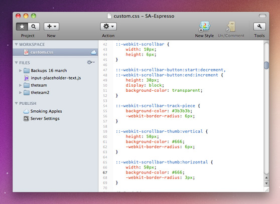
This will style the scrollbar thumb itself. Background-colour, add some -webkit-border-radius, add a border if you’d like to make it float within the scrolling area. I don’t know what height (or width when you specify the horizontal thumb) does to the setting, but Tim left it at 50px for both, which works for me. If your site uses a lot of background graphics, changing the opacity of each element will improve visuals while maintaining usability. Download this style.css file if you want to review the changes needed to achieve the scrollbar in the screenshot above.

That’s pretty much all you need to do to style the scrollbar, and it should work. The good thing is, if your visitor has something other than a Webkit browser, it degrades quite nicely—they get the default scrollbar. It’s not perfect degradation, given that there’s some whitespace at the right, but for people who use substandard browsers, that shouldn’t matter anyway. Remember that altering the scrollbar is a major change in user interface, one that a lot of users might not be comfortable with. Take care to make sure the widths, colours, and rounding matches your theme, and most importantly, know your audience. If you’re not sure, don’t do it.
I hope this guide helped in the least. If you have questions, I’m not sure I’ll be able to answer them, but I’ll try. This was an experimental article. While we’re usually focussed on appreciating the work of the greats, I thought a little education on the side couldn’t hurt. Let us know if feel against this kind of content on Beautiful Pixels, or preferably, if you do appreciate it.
Disclaimer: I have not studied the official Webkit texts, so if don’t hold me responsible for spreading misinformation. This is just how I’ve reverse engineered Tim Van Damme’s site. For further information, visit webkit.org’s article on styling scrollbars.
