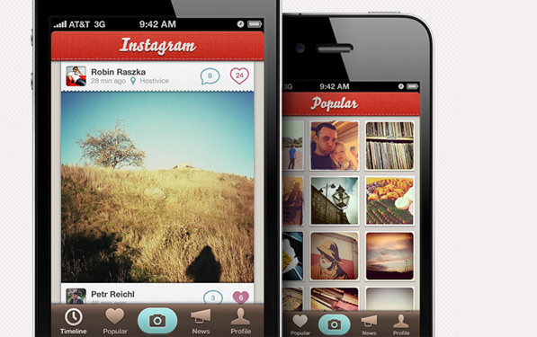
Robin Raszka of Tapmates, redraws the Instagram user interface with better pixels:
Instagram is one of the hottest photo sharing apps on the App Store right now. There’s one problem: it doesn’t look that great. At Tapmates, we take pride in our icons and user interfaces, so we decided to mock-up what it would look like if we made it. Keep in mind that this is for personal reason—Instagram did not hire us to do so.
If you like what you see up there, click through to see it in full retina pixels. I hope the Instagram team sees this.
