I hope everybody reading this is aware of Tumblr by now. If you ask me, I think of Tumblr as a pro-multimedia Twitter on steroids without the 160 character limitation. Tumblr is a powerful blogging platform that lets you create one or multiple ‘tumblogs’ under your Tumblr account. The Beautiful part of Tumblr that has always excited us is that it is beautiful. Their website is very welcoming to the new-comer and their choice of colour, icons and font makes one want to use it. Tumblr’s official iOS app got a major design overhaul a month ago. Today we’re going to talk about the updated Android app which came out just a few days ago.
Fire it up the first time and it starts with beautifully placed content pulled from various categories. I just love it when apps don’t force you to sign up before letting you in. You can casually browse through the content feed right away! A hash-tag denotes the category above the pictures or words and there’s all sorts of things for you to check out — everything from tattoos, sailing, interiors, comics & even nail-art, pretty much everything is all in there. Unfortunately, you can’t search for content from the front page, you’ll have to login to do that. The app makes us weak in the knees with its pull-to-refresh animation; beautifully depicting the variety of content you’re in for when you use Tumblr. The same animation is also seen when the app is pulling more content at the bottom of the page. You can login or sign up for a Tumblr account on the first page.
Alright, let’s say you’ve stumbled across a topic of your liking, you can follow it using the ‘Track’ button. Your tracked categories show up when you click the search box. Post login, you have a simple interface with three screens depicted simply by icons and not names. I’d describe them as home, tags, and user area. Home shows you activity of people you follow. You can easily find your friends on Tumblr by letting the app go through your phone contacts or Facebook friend list. Start following friends and a feed is shown with chronologically arranged content from them. Under each post, there are two buttons; the first one allows you to ‘reblog’ it to your own tumblog, and the second heart shaped icon is akin to the Like button on Facebook.
[showcase slug=”tumblr-for-android”]
The interface may not look Holo, but it supports the convenient side-swiping gestures to move from one screen to another. Moving to the ‘Tag’ screen shows the same thing as the opening screen of the app, with the addition of the search bar at the top. Finally, the ‘user area’ tab shows you notifications, content you’ve liked, people you’re following and the app settings.
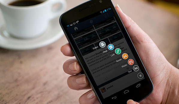
Coming to the content creation part of things, you can quickly share a video, photo, text, quote, links and even chats at a press of the button to the bottom-right. The moment you tap that, the background darkens and an array of icons pop out in a curved arrangement — yet another beautiful moment in this app. This button also conveniently disappears when you’re just scrolling through. One thing missing from the Android version of the app is the ‘Photoset’ feature, that lets you create collages (it got integrated into the iOS app in the last update).
Tumblr’s updated Android app is supremely simple in design and use, and gives you most of the tools to enjoy using this platform. Also, at the moment it is probably the one of the better designed official apps when compared to other social networking platforms. You can download it Free from Google Play. The iOS app, too, is available Free on the App Store.
Ed’s note: The one feature that I love in Tumblr’s iOS app is the way I can tap and drag the compose button upwards to take me directly to the camera view. It’s brilliant.
[Masthead via PlaceIt]
