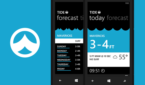
Back in March I watched a concept video of a surf guide app called Tide. It looked amazing and fitted perfectly on the platform shown in the video, Windows Phone. While Microsoft is paying developers for app numbers, the store is getting loads of garbage in the name of apps. Luckily there are gems like Tide that make the platform shine. Martin, the developer, has posted a few sketches of Tide along with the story of why he made it here.
Tide isn’t an over the top app with detailed information and statistics. It displays the information you need brilliantly. On launch you see the lovely waves animation that is used throughout the app. You can browse the various surfing spots in various continents and add the ones you visit to your favourites. The app refreshes the forecast on launch and you see a summary of it below the name. The best part of the app is in the detailed location view. The today view tells you how high the waves are with the temperature right now and a heart rating for the waves. A full solid heart rating indicates more powerful and organized waves. The swell and wind direction show how long a wave takes to pass. The wave changing animation adjusts to the conditions mentioned below. You can tap and slide up or down to see how the condition changes as time progresses. This is very similar to how you check the weather in Solar. The forecast gives you a summary of the conditions over the next few days. You can even track the high and low tide times with sunrise and sunset from here. The units used to display data can be changed from the settings screen.
Apps like Tide and 627.am give you hope for better apps on Windows Phone. Tide is available for free on the Windows Phone Marketplace and it looks gorgeous on my Windows Phone 8X. It is available for both Windows Phone 7.5 and 8.
Masthead via Caleb Khazoyan
