After Google shutdown Reader a few months ago, a lot of new RSS services & apps sprung up and hit the market. In the last several weeks, RSS enthusiasts have seen quite a few web-based services being released as alternatives to Google Reader, along with apps that sync with these services. I personally subscribe to a lot of feeds and have tried most of the services, finally settling on Feedbin. My ideal setup for RSS involves client apps on my Mac, iPhone & iPad powered by a service that works in the background and syncs my feeds and their read states across these apps. Feedbin manages to do a stellar job & works great with apps that support it. Up until now, I was comfortably using Readkit on my Mac & Reeder 2 on my iOS devices. That is, until Fiery came along.
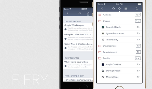
Fiery is a new RSS app for iPhone (iPad version is in development) that works with Feedbin or Fever accounts. It sports a slick, very iOS 7 like UI and looks great. Fiery supports multiple accounts, so if you have more than one account for any reason, Fiery’s got your covered. It uses thin icons & glyphs along with a dark, unified status and nav bar, making you feel right at home on iOS 7. Once you navigate into an account, it displays your feeds & folders in a single list on the main screen. You can jump between starred, unread & all items using the 3 glyphs at the top. The folders display the unread count at the right, which you can tap to expand the list to show the folder contents. Tapping on the folder name navigates you to the articles from all feeds in that folder. In this screen, Fiery groups your articles by time (Last Hour, Last 6 Hours, Last 24 Hours, Last 3 Days) or you can group them by feed source. Tapping on an article opens to reading view, which is minimal and looks great. Here, you can customize the view by changing the title & article font size, and choose from fonts like Avenir Next, Helvetica Neue, Hoefler Text, Baskerville & OpenDyslexic. I love how the action sheet dissolves in from the top.
Fiery allows you to swipe horizontally between articles till you reach the end. Unlike Reeder, wherein you have to scroll to the bottom of an article to jump to the next one, this method lets me quickly jump through multiple articles by just reading the article title. Fiery also has arrows at the bottom if swiping isn’t your thing. The app supports a bunch of Sharing services including support for apps like Chrome, Tumblr, Tweetbot, Netbot, Riposte, Buffer, Drafts, Things & Omnifocus.
Fiery’s most amazing feature, the one that managed to replace Reeder 2 on my iPhone, is its ability to sync in the background. As much as I like Reeder 2’s UI, the fact that it lacks background sync is a deal breaker for me. With Fiery, I can jump right into the app and start reading the news feeds and the app’s badge tells me when new articles are ready for me. The developer has done a remarkable job with the app and I’ve been really enjoying using it on my phone. Fiery is available on the App Store for just $3.99.
