Google announced a whole lot of new things at Google I/O 2018 this week. Most of the new stuff that was announced isn’t consumer facing stuff but more behind the scenes goodness based on machine learning and AI. However, there definitely were some notable updates to product design and UI across the board, all thanks to the company’s Material Theme Editor. Google has created a custom Material theme for use in its products and we’re already seeing in implemented in products such as the new Google News and most recently, the new Gmail. Today, the company has announced that it will also update and tweak the UI for Google Drive on the web.
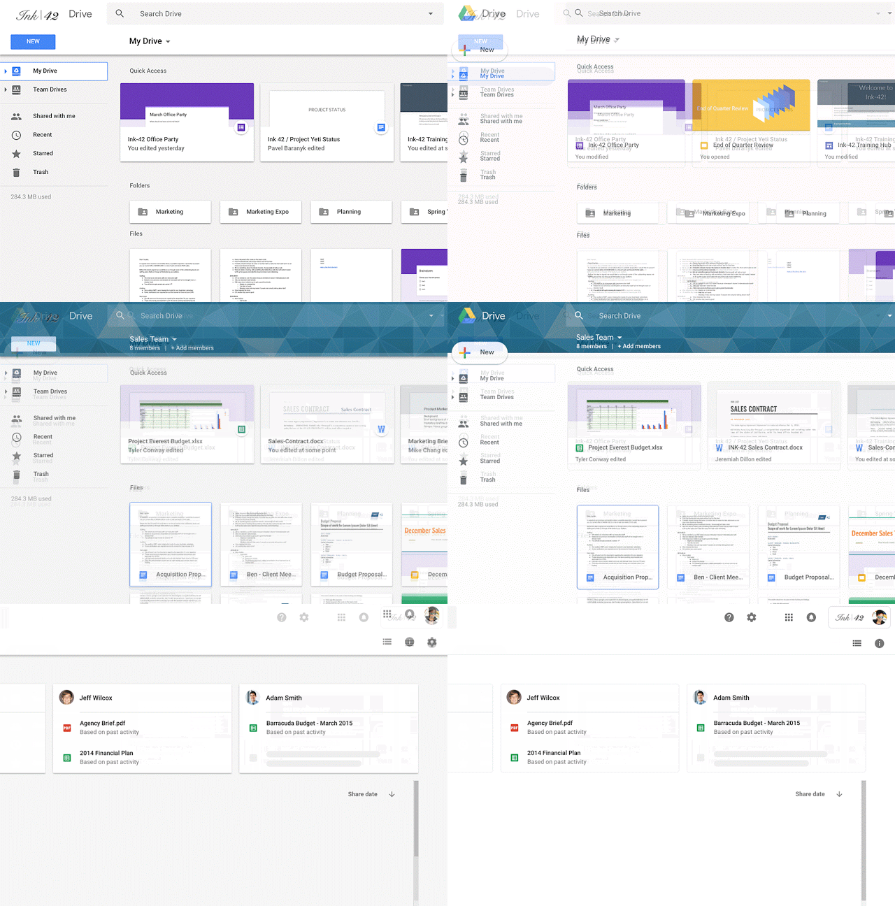
We’re making some updates to the look and feel of Google Drive on the web. There’s no change in functionality, but some icons and buttons have moved, and there’s a range of visual tweaks to align with Google’s latest material design principles. We built that this new interface to create a responsive and efficient experience for Drive users, and to feel cohesive with other G Suite products, such as the recently redesigned Gmail.

This isn’t a major overhaul of the UI, but instead small tweaks here and there to bring the UI in line with the modern material design principles. As part of this change, the old logo in the top left has been replaced with the Google Drive logo, while your company’s custom logo has been moved to the top right. Buttons and highlights have been tweaked to be more rounded and elegant. The headers get a new font and most notably, the old blue “New” button has been replaced with a nicer white button like in the new Gmail interface.
These changes are already available to G Suite accounts on the “Rapid Release” track, while those on the Scheduled Release track will be seeing these in the next two weeks.