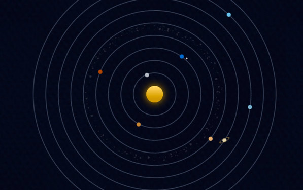
[tweetmeme]Oh. My. God. Somebody has recreated the solar system using just HTML and CSS, and yes, they didn’t forget to make it drop dead beautiful. The animation is so smooth on my iMac, and even presentable on the iPad. The attention to detail goes down to the space junk between Mars and Jupiter, and the eclipsing of the moon as it revolves around the earth.
Our Solar System is by Alex Giron (@alexgiron), a web developer and designer from ‘Old Town Alexandria’ Virginia. He explains his experiment in a blog post:
These past few months I’ve been exploring CSS3, trying to learn some of it’s new features and getting a feel for which browsers support it. A few weeks back I put out my first experiment exploring @font-face and transforms. This time, I set out to experiment with border-radius, and what I thought was going to be a boring little project turned out to be quite interesting.
While you’re there, don’t hesitate to further explore Giron’s site ‘neograhy’. Take a look at the twitter counter on his front page, or try copying a block of text from his site and notice how some words are broken up (yet appear normal on the site), or drool over the beautiful layout of his photography portfolio. We’ll definitely be keeping a close eye on him from now on.
