It’s raining journal apps here on Beautiful Pixels. It started with Journey for Android, Heyday for iPhone and now STEP Journal has showed up on my homescreen. At this point, a seasoned BP reader must be thinking – who needs more journal apps when we already have Day One? You sir are right, but Day One is a paid app and in the world we’ve built for ourselves, that severely limits its reach. In the ‘free apps’ market, the journal app space keeps getting interesting with every passing day.
STEP, just like Heyday, is also an automated journal app. It too will compile photos and locations from your phone in one scrolling feed. After you’ve granted the app access to your Photos, Locations Services and Calendars, the app will ask you to integrate with social platforms. These include Facebook, Twitter, Foursquare and Instagram. You can even connect fitness trackers likes Fitbit and Jawbone UP. The way things are going, I suppose MyFitnessPal support is only a matter of time. There’s a fundamental difference between STEP and Heyday and other automated journals, one that STEP’s promotional material doesn’t highlight. While STEP will import the updates from connected social networks, it will only show you posts from the last 7 days, that’s it.
After you’ve connected your accounts, you’ll see your own posts from the social networks pop up in the feed. But that’s not all, the app has pretty robust journaling features as well (which doesn’t have the same 7 day limitation). You can add notes, locations, photos and activities as journal entries. There’s also a Statistics page that gives you a graphical representation of all your activities.
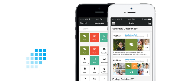
Every update in STEP is split into three boxes – photo, activities, and friends. When the app imports a photo, instead of it taking over the available space, it still shows the two other empty boxes and that just doesn’t look good. But it does encourage you to add activity or tag your friends to fill in the space. Design wise, STEP seems like just another iOS app. Updates take the shape of cards, similar to Google Now. There’s a dark sidebar on the right with white font and a totally out of place + button with a blue background sits in the bottom left corner. I don’t know if it’s just me but after 1.2 million apps on the App Store and almost a year of iOS 7 design language, a lot of iOS apps still look generic. Not bad per se, but not something that make you go “woah” either. STEP is one such app. But not all hope is lost because once in a while, apps like Unread and Overcast do delight us. And with all the new functionality in iOS 8, things can only get better.
Activities feature in STEP is the best thing about the app. You can basically tag entries with things like hangouts, coffee, drinks, movies, books etc and then the Statistics page will give you an overview of these activities on a day-to-day bases. You can tap individual activities to see graphs and streaks.
As STEP only shows you posts from the last 7 days, it’s better to archive your Facebook and Twitter updates in Evernote using IFTTT recipes. As I said, STEP’s manual journaling features are pretty good, but the implementation leaves a lot to be desired.
Journal apps are personal. The things you write in them are usually what you don’t want anyone else to read, which is why the first thing you do is protect it with a password. But with all the social media and device integration, STEP is stretching the definition of journal apps. It’s trying to do everything. The automation stuff is good, but the manual journaling seems more like an afterthought. If you’re looking for a pleasurable, personal journaling experience, just buy Day One, it’s worth it. If automated self-exploration with a sprinkle of activity tracking is what you’re after, STEP Journal is available for Free on the App Store.
