Ever since YouTube and Vimeo democratized the distribution process of filmmaking, there’s been an abundance of online video content to watch. And while a lot of it is really good, it’s just lost in the noise. But where there’s friction, there are at least a couple of apps trying to solve the problem. Video discovery platforms like 5by and Showyou come to mind. While all of these apps have some combination of aggregation, personalization, and an endless feed, they were still mostly just repackaged YouTube apps. Hyper is different. It’s an app made by filmmakers, dedicated to curating what they feel is the best content, and limiting it to just 6-12 videos a day. Just 6-12 videos, chosen by human editors on their team, that’s it.
The first screen of the app’s onboarding process is a looped, low-contrast video of team behind the app. These are real people, leaning against a wall while their hair is swooped up by the wind. This combination of low contrast filters, looped videos and the creators’ personality is prevalent across the app. To me, it’s the app’s simplicity that is the most striking. In both design and functionality. Having tried countless video discovery platforms, using Hyper is like switching from a cluttered mainstream magazine to a curated, niche one (like Offscreen).
You don’t need to create an account, give out any information, follow people or categories — nothing. You just open the app, find new videos every day, and if you like something, just start watching it. Hyper has a Beats 1 vibe. Everyone using the app has the same experience as you do. And as the world has been rediscovering radio in the past few weeks, there’s certainly a bit of romance to that.
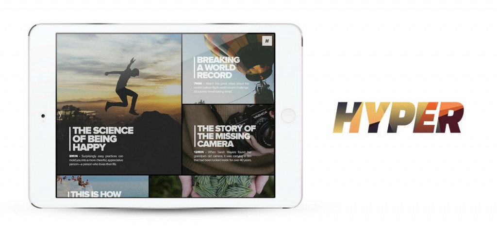
Hyper is pretty simple by design. It’s homescreen has a grid layout, with one large tile accompanied by two small ones. The app makes use of big, bold and beautiful white typography across the app. And the type usually sits on top of a still or a looped video with a low contrast filter. While many are tired of this look thanks to every single cover image on every site ever (thanks, Medium) – and some, like Wildcard are trying to put their own spin on it – here, it works. Because, again, it’s consistent.
Hyper also vastly improves upon YouTube’s embedded player, which isn’t the best-looking thing around. Comments are thankfully disabled and the description is hidden behind a button. The most important parts – the scrubber, video quality and sharing options, are front and center.
Every day, Hyper brings you new videos in the form of a curated “Edition”. You can view previous Editions by swiping in from the left edge of the screen. Let’s talk about the videos. Yes, the app is well-designed, but it’s the videos that are going to keep you coming back to the app. I’ve randomly browsed some of the previous 30 odd Editions and I’ve found that usually, Editions follow a theme. The videos, in general, are about adventure, science, arts, the current social economic issues and the future of humanity. I’d characterize most videos here as being thoughtful in nature. If you’re looking for BuzzFeed style or stand up videos, Hyper isn’t for you. Hyper is for someone looking to be inspired or awed.
Overall, I’ve been pleased with my time with Hyper and I’ve turned on notifications for both new videos and recommendations. But I think there’s one place Hyper’s loopy videos don’t exactly work – the Edition page. Because at any given time, you’re looking at 5 of those boxes. All of them scream for your attention and it makes reading the text harder. Maybe the creators could switch to stills here instead, or make the boxes bigger. Hyper is exclusive to the iPad right now and available for Free on the App Store
