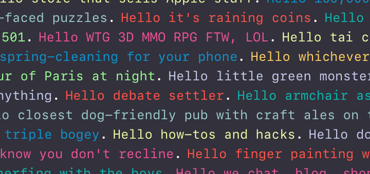
Every year at WWDC, Apple has some really clever artwork on display for the attendees that celebrates the Million+ apps in the iOS ecosystem. This year, at WWDC 2016, Apple had a massive wall comprised of colorful text with clever phrases related to apps. There’s a very good chance someone on Twitter on Twitter timeline posted or retweeted a photo of this wall during the WWDC week. Here’s what it looked like:
Hello, wall of text #wwdc pic.twitter.com/YuLbIvvetS
— Andreas Muth (@amx01b) June 14, 2016
Inspired by it and powered by a simple case of curiosity, Martin Conte Mac Donell from Lyft wondered if it would be possible to get not just the text of every sentence up on the wall, but also the associated color.
At Lyft we foster a culture of curiosity because we believe curiosity is the root of innovation and by following our inquiries we sometimes end up working on unconventional problems. This year at Moscone Center for WWDC we had one of those “what if” moments where just by articulating the question we’d be committing our next few days to the terminal.
Apple welcomed us in an imaginative and playful way. A wall of sentences pared down to the essence of apps but without removing poetry.
Armed with this, he set out to try and build exactly that. And well, he succeeded, and quite spectacularly at that.
Head over to http://wwdcwall.com/ and check out the glorious wall of text in all its beauty. And you can read about how he managed all that, including the nitty-gritty, over at this Medium post of his.
