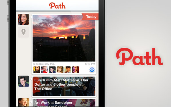
As much as I think the service is uninteresting, Path surely has some good design in its iPhone app. Everything from the sign up process to viewing friends, to publishing pictures, it’s smooth pixels all the way. When I first saw the screenshots, I thought this was an app I’d use every day. It was only when I got to know the whole story did I figure it was a waste of my time.
Path.

Previous ArticleAirbnb — Start thinking of excuses to book a bnb
Next Article The Feed, a refined approach to RSS on the iPad