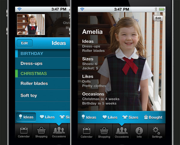
What is with me and custom tab bar styles? I just love em! They might be superficial and add no extra functionality, but if done right can be insanely pretty. Gift Plan from Glasshouse Apps (the guys who made Barista and The Early Edition) is an app finely tuned for a Christmas gift shopping experience — that practically begs for a superficial design.
Personally I don’t know if you need a shopping app like this (as against having a text note or a calendar event), but let’s play along anyway — it is pretty pixels after all. It comes with an extensive set of features for adding people, events, reminders, right down to storing gift ideas and likes for each person. Seriously, you can very well apply the bazooka-fly analogy here.
But what makes the app irresistible, is the UI. That tab bar you see? It’s less of a tab bar and more of a scroller, so your currently selected item is always in the center. It’s a very questionable UI choice, and probably shouldn’t be attempted in more serious apps. They’ve also polished up the buttons and UI styles making them very ‘gift themed’, with varying shades of blue all over the place. What sets the app apart, is how it displays profiles of people, with a full sized image and text overlayed, which is very Windows Phone 7 metro-ish.

The app is on a holiday special $0.99 price, and if you’re the kind who buys a lot of gifts, this is a slick app to have. Again, have you seen that scrolling tab bar?!
