I had two apps on my iPad that did pretty much the same thing: Air Display and DisplayPad. Both turned the iPad into a secondary display, and both offered touch as an input for controlling your desktop. One of them had to go, so obviously the better looking one would remain. How can an app that has no pixels of its, manage to come across as beautiful?
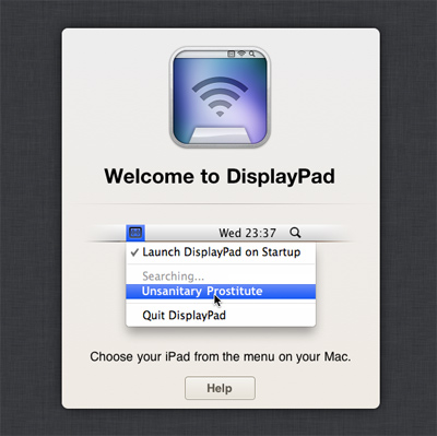
It all starts with the icon (designed by Christopher Downer), a vibrant mix of blue and green, with the right metaphors to explain what the app is all about. A great example of how a good icon can make or break your app. Next, when you launch the app, you’re shown a clean start screen, which goes as far as grabbing the name of your iPad and pasting it in the demo screenshot [below] — something you don’t notice until you do.
Once you’ve selected your iPad from the Mac, the UI disappears, leaving you with a 10 inch external display. The last count that DisplayPad wins, is its rock bottom $0.99 pricetag for the holiday season. It really is a splendid app, I use it more often than I thought I would, and I was glad to host a…
DisplayPad + Cloud Calendar giveaway
The guys at Clean Cut Code offered us 10 codes each of DisplayPad and Cloud Calendar ($4.99 — the iPad Calendar like app that syncs beautifully with Google Calendar). Just send out a tweet with a link to this article. If you feel that’s spammy to your followers, send an email at contact@ this domain.com to be eligible. Winners in 24 hours. UPDATE: Giveaway over.

