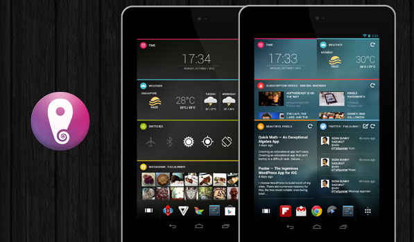
Ever since its debut on Kickstarter, Chameleon Launcher has been turning heads because it is unique and looks amazing. After getting funded and a month of beta testing, Teknision have finally released Chameleon Launcher for Android tablets on Google Play. It gets its name because it aims to switch homescreens depending on conditions like time of the day, wifi network or GPS coordinates.
Chameleon Launcher is by far the best looking launcher for Android tablets. It is entirely widget driven and unlike other launchers, this one relies on its own widget design. There are advantages and disadvantages here. The widgets look amazing and since they are all made for chameleon launcher, they look great together. As of v1.0.1, the launcher has 9 types of widgets including Facebook, Twitter, Instagram, Gmail, YouTube and an RSS feed widget. Widgets can be added by tapping and holding on any blank space on the screen. The editing screen has another tab for wallpapers. The launcher comes with a set of wallpapers and a provision to add your own by sharing an image with chameleon widgets. The wallpapers included are really nice and they make your homescreen look drool-worthy. You can delete wallpapers from here by holding and then dragging into the trash on the top left of the screen. The main homescreen on this launcher has a row of apps at the bottom that you can customize for easy access and a button bring up the app drawer along with one to edit the homescreens. Transitions between homescreens and swiping through widgets feel buttery smooth. The app drawer looks exactly like the iOS app drawer.
Widgets here are unique. The widget functionality depends on the size and the size is customizable. My favourite widgets here are switches, Instagram and weather. Chameleon Launcher definitely has the best looking power toggle widget and while the brightness button takes you to brightness in settings as opposed to actually changing the brightness with a tap, it resizes very well. The weather widget either shows you only an icon with temperature (along with the high and low for the day) or a scrollable forecast depending on widget size. The Instagram widget implementation is interesting. It looks similar to the actual app if you give it one column of space and it has a nice gallery of your feed if you give it some more room. Some of the widgets available for use are limited in functionality. The Gmail widget only lets you view unread messages for a specific account. I am disappointed that there is no music playback widget as of this version. They have an API that encourages app developers to work with them to bring more widgets to the launcher. Another disadvantage of the widgets here is that they launch native apps only. Tapping an unread message in Gmail only launches the app and not the message.
Going from Nova Launcher to Chameleon is a big change. Chameleon Launcher is breathtaking overall and is only held back by a few problems. While the widgets look nice, they are too few for most people. The switching of homescreens should also work for subtractive conditions like leaving a wifi network. I had a few widgets go blank or need reauthentication even after the latest update. The main drawback here is the price. For a launcher that costs a little over $10, you expect a perfect launcher with many widgets. Hopefully more widgets are added along with 3rd party app support in the near future as this makes the UI on Android tablets very beautiful. I really wish there was a way for me to make this my lockscreen because I would pay for a lockscreen that looks this good and that is this functional. As of now, I keep switching between Nova Launcher Prime and this. Chameleon Launcher is available on Google Play for a little over $10 and if you backed the Kickstarter project or pre-ordered it, there’s a separate version available.
