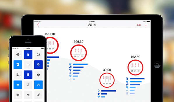
I’ve tried my fair share of expense trackers. Attempting to log every penny I spend — be it my electricity bill or a cup of coffee, trying to get an exact idea of where all my money ends up and hoping to manage it in a better way. I’ve tried my fair share of apps, ranging from Expense Manager for Android to Finances for iPhone but the process soon got too boring and nothing stuck. Next 2.0 seems to be simple enough to keep me going and powerful enough to manage my money better.
Next has two different apps for the iPhone and the iPad ($1.99 each), instead of one Universal app. The data is synced between the two apps flawlessly and the iPad app utilises the extra screen space well. You also get options to export your data to any other app or on an Excel sheet incase something better comes along.
Next for iPhone
Next for iPhone has a three page layout. The center page being the main screen carrying all the categories. You’ll find statistics on the left and a list of expenses on the right. The category page is where it all happens. This screen shows you a grid of 5×3 icons for different categories ranging from clothes to transport to apps (the developer totally gets it). You can tap and drag around the icon to change its position or tap and hold and then press the incredibly tiny settings button to change its icon to something else. The used icons will show up in blue while the most used in red.
This, ‘get in, do your thing, and get out‘ approach works wonderfully well for expense tracking. Open the app, tap the relevant icon for your expense, and up slides a numeric keypad. Type in the digits, add a description if you want by tapping the pencil icon (which appears only after you’ve entered the amount), hit the checkmark and you’re done. Keeping track of your exuberant spending has never been easier.
The statistics page will show you a list of all your spendings in descending order. You can sort it by Week, Month or Year and tapping on any category gives you a detailed graph of your spendings.
Next for iPad
The iPad has the same UI and elements but shuffles their placement to make better use of the larger screen. Instead of the categories, statistics take up the only homescreen. Tap the red + button on the top right corner to get the categories view and add an expense. The swipe and tap-and-hold gestures no longer work, you have to hit the Edit button for that.
You start out with the years view with different months represented by circles. Tap on a month and you get into the weeks view. Tap further for a day by day break down. If the iPhone app was made to make entries as quick as possible, the iPad app is clearly designed to get your hands dirty with the statistics. While it seems like a lot of taps to get where you want, it does provide you with relevant expenditure at every stage.
Next is simple (there are no currency units). So far it’s been able to get me to log my expenses successfully. There’s not much to talk about its design as it does a good job of getting out of the way. Although some elements like the settings icon can surely be improved upon. The pencil icon which allows you to add a description for your expense, which was added in the 2.0 update can be easy to miss if you are not paying attention. These small grudges aside, which I hope will be taken care of in future updates, Next is a strong contender to become your go to expense manager. It is available for iPhone and iPad on the App Store for $1.99 each.
