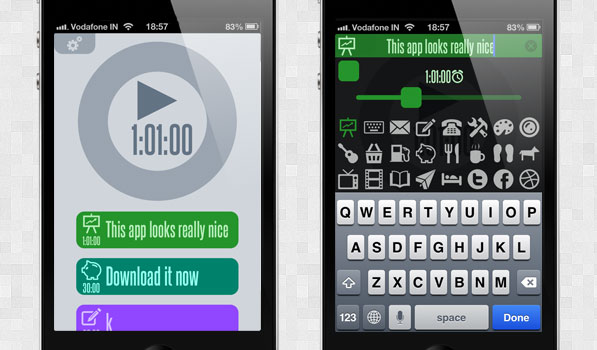
Back when Clear was about to launch, there was a ton of hype around it because of the nice looks, sound and gestures in the app. Many have tried to replicate what clear does visually and failed. 30/30 timer by Binary Hammer is a simple beautiful app with a few familiar gestures involved.
30/30 is full of solid colours and you are presented with a nice big timer with tasks below it when you launch the app. All the text is very readable and looks nice and big on the iPad. The tasks are here to guide you on using the app. Tasks are customizable and there is almost no limit to the number of tasks within the app. Each task has a label, time, icon, and colour. Make no mistake of it. This is no ordinary timer app and has the functionality a basic to-do app would have as well. When you complete a task you swipe it to the right or left to delete it. Adding a new task is done by pinching between two tasks or anywhere under the dial. Tapping and holding the dial will stop the timer. I really like how simple this is compared to most other full fledged ‘getting things done’ apps. Even though the app name is 30/30, it lets you customize the actual time as most things in life do not go by a half hourly cycle. The settings page and help page are really nice as well. The settings page is full of elegant icons and I think I like the settings page more than the overall app just for the looks.
Binary Hammer have a winner here with 30/30 and the pricing is very interesting. The app itself is free with full functionality but they have setup in app purchases as gratitude payments. This concept will definitely appeal to the end user. It is definitely worth getting and if you enjoy using it and find it useful, consider looking at the in app purchases. 30/30 is available on the App Store for free.
