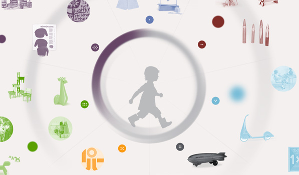
When was the last time a website blew your mind? I have covered numerous websites that have amazed me with their use of the latest web technologies in the most creative ways and yet, when I came across this website for the Century of the Child: Growing by Design, 1900–2000 exhibit, my mouth was left wide open.
The site is a prime example of exceptional use of HTML5 and CSS3 to present the content in the most beautiful and creative way. It makes heavy use of sprites, animations and has been designed and developed by the creative agency of Hello Monday.
But what is the site about? Here’s what it says:
Century of the Child: Growing by Design, 1900–2000 takes both its title and its launching point from Key’s landmark book, which predicted a new preoccupation with the rights, development, and well-being of children; Key argued for progressive design as the means of shaping children’s experience of living in a rapidly changing world. Arranged in seven sections, this exhibition and website tracks the confluence of modern design and modern childhood, presenting individual and collective visions for the material world of children, from utopian dreams for the citizens of the future to the dark realities of political conflict and exploitation.
A diverse array of ideas, practitioners, and objects illustrates how progressive design has informed the physical, intellectual, and emotional development of children and, conversely, how models of children’s play and pedagogy have inspired experimental design. Toys and books, playgrounds and schools, political propaganda and therapeutic products—all are brought together here in a kaleidoscopic narrative that remaps an international history of modern design.
I was left amazed right from the moment a progress indicator appeared on the screen. Instead of the boring circular indicators you’ll find on most sites, this one has a circular indicator that you can play with. Move your mouse around the center and its colors move with it. So awesome! The entire website is filled with a whole lot of pixel love and animated goodness. For a moment, I couldn’t believe this wasn’t Flash.
The site is best experienced when you utilize all your screen estate, so switch your browser to the full-screen mode and go visit the site here.
