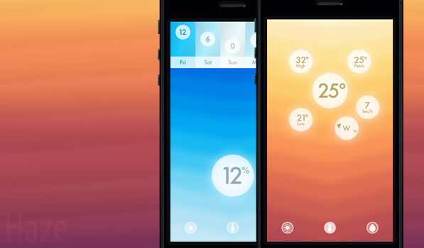
I’m done with weather app introductions, so I’m gonna talk about Robocat here. I’m a big fan of in-app sounds and animations and few do them as well as Robocat. After impressing us with Thermo and Televised in the past, they are back & this time with a weather app. Haze is designed and developed by Robocat and Taptanium.
When I first saw Haze I assumed it would be like Solar but with the Robocat touch. It is very different. Haze relies heavily on visual subtleties to convey information in addition to gestures for in app navigation. The sounds in the app are a lovely touch. Upon first launch, as with every weather app, you are prompted to grant access to your location. A quick tutorial later, you are knee deep in bright and colourful animations. The app has 3 main modes. The first is the one in the middle that tells you the current temperature in a orb that looks like the sun. Some of the animations are so bright that it really does look like you’re staring at the sun. Tapping this orb will reveal 5 smaller orbs with more details like wind speed and high & low temperature for the day. The wind direction orb is really nice. It uses the iPhone gyroscope and changes direction in real time as you move the iPhone. This is much better than every other app that just lists the direction. You can navigate between sections by tapping any of the 3 small orbs at the bottom, by swiping in the appropriate direction or by using tilt control. I am not a fan of accelerometer based controls so I stuck to swiping. The orb with a sun icon tells you how many hours remain for sunrise or sunset. Tapping the orb reveals five smaller orbs with sunrise and sunset times, cloud coverage and UV rating for the day. The last section has the precipitation. Tapping on this reveals an icon with an umbrella indicating whether you need one or not along with humidity and atmospheric pressure levels. The backgrounds in the app are not static and the direction in which the animation moves indicates whether the current section you are in is about to see an increase or decrease tomorrow. While this isn’t the ideal way to indicate it, it hasn’t been done in any other app. A slight swipe down reveals a 5 day forecast in each section with orbs places in one row at the top arranged depending on condition. Swiping down further reveals the settings screen that allows you to toggle the units, sounds, themes and tilt control. There are themes that can be unlocked for the app by doing various things some of which are in the settings screen. There’s also this nice quote related to weather elements that is randomised below the settings screen.
Haze by Robocat and Taptanium does many things nicely. It isn’t aimed to the weather detail enthusiasts who want a radar view and dark sky integration. Fans of Solar will appreciate this for sure. One thing I didn’t like is the lack of an option to add more locations or even edit the current location. Some of the orbs have a slightly jagged border as well. Hopefully updates fix these minor issues soon. Haze is a steal at 66% off right now. It is available on the App Store for $0.99.
Editor’s (@preshit) note: Every time we write about a weather app, we get a ton of questions all singing the same tune — “Another weather app?”. However, Haze is so phenomenally good at what it does, I had to make an exception. After a few minutes with the app, this is what I said to Mikhail:
The animations are so fluid, Fluid app should give up its domain name and point to gethaze.com
At $0.99 on the App Store right now, you should check it out.
Update: Added detail to clarify that app is the collective work of Robocat & Taptanium.
