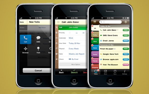
There may be thousands of apps on the App Store, but only one kind make it to my iPhone—the beautiful ones. A few turds do slip in a way, but for most part I appreciate sensible design along with some visual flair. That’s why I had to check out 2Do, a task list manager with a stupendously beautiful UI. As I later found out, it’s also got some serious features that earns it a good review.
2Do’s primary screen is much like a compact notepad, with tabs segregating your personal and work tasks. It’s not minimal in its approach, but that’s not a bad thing in this instance. The primary workflow I’m concerned about, is adding new tasks. Tap the plus button, and the new task sheet floats in with the title selected. You can then confirm the task, or add details to it if you want to go deeper. Apart from regular metadata like due date and priority, 2Do comes with some useful stuff like Alarm (push alerts or email), Action (Call, SMS, Browse, etc). Overall it strikes a good balance between simplicity, efficiency, and complexity of tasks.
[tweetmeme] 2Do’s main UI also sports some neat tricks. You can tap-drag and drop tasks into different calendars (wow), swipe to complete, show hide the calendars, and organise your tasks according to any criteria. Above all, it’s really a slick app, and I really enjoyed using it. It’s $5.99 for the full version, but now comes in a ‘lite‘ version so you can test run it before.
