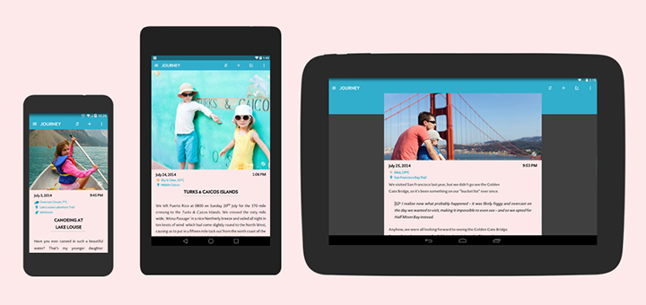
While iOS and Mac have the excellent journaling app, Day One, Android, well, doesn’t. There’s been chatter about an Android version from the developers of Day One but nothing has materailized as of now. Android finally gets a really good Journalling app with Journey. On first look Journey looks similar to Day One but that’s not giving the app enough credit.
Journey gets the basics right. There’s sync (using Google Drive), location tagging, photos and music data import, tagging, passcode lock, reminders, exporting and even basic Markdown support. Unfortunately not MultiMarkdown so if you’re like Shawn Blanc but on Android universe you can’t use it to pen down your coffee habits in pre-formatted tables.
Journey isn’t a Day One ripoff. When you take a step back you see the early signs of an app properly adopting Material Design before it’s even out. Sure, Journey doesn’t have that circular floating action button and the fancy Z index with corresponding shadows, but it gets a lot of things right. I suppose those will be added in future updates, when the L release is public.
What’s impressive is that even without those elements the app looks beautiful and feels great to use. It follows Android L’s grid based style guide well and the app scales up to 7 and 10 inch tablets wonderfully. The complimenting shades of blue look great on tablets and on my KitKat phone (looks even better if you have the Android L Keyboard installed).
The jury on Android L’s excessive use of ripples, animations and shadows is still out and I’m reserving my judgement till the final release but from what little time I’ve spent interacting with the web elements, I’m not too impressed. Even this Instagram Material Design concept, while beautiful, seems like it will slow me down. Yes, iOS 7 does that to some extent but it’s limited to the Springboard. This is on every screen. Journey doesn’t go full L but still manages looking perfect for the platform.
Journey is made by 2 App Studio who brought us JotterPad X, my favorite Markdown writing app for Android. Sadly, the writing pedigree doesn’t translate as well as I hoped it would. Instead of the normal Markdown shortcuts panel above the keyboard, you need to press and hold a button for a popup. There’s a lot of unnecessary finger dragging involved. I’ve also been spoiled by JotterPad and Day One’s varied collection of fonts that’s sorely missing here. That’s another thing I’m hoping gets sorted out in a future update. You can never have too many font options.
The app is free but a $4.99 IAP gets you Markdown support, a dark theme (which is gorgeous by the way) and support for printing and PDF exporting. If you’re not a power user or have no idea what Markdown is, you can easily get by with the free app. Journey also has a web component but right now that’s only for viewing your journal. A true web client would be of great help to users who don’t always write from their phones (which is almost all of them). Journey is available for Free on Google Play.
