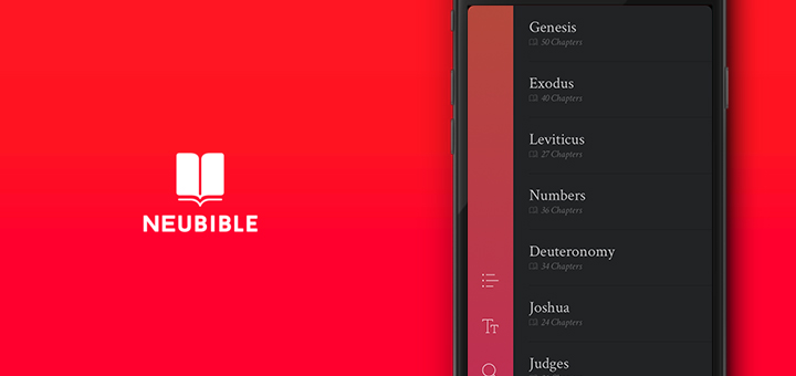
NeuBible by Quiet Pupil is one of the best looking apps I’ve ever used. I came across the app a few weeks ago while I was tracking app sales and the icon instantly caught my attention. NeuBible is not only the best looking Bible app out there, but it is the best looking reading app, and I think I enjoy its looks way more than Unread, which is something I never thought I’d say.
NeuBible is an app by ex-Apple designer, Kory Westerhold, and his childhood friend and Yahoo Design Director, Aaron Martin. They’ve spoken to Fast Company about the philosophy behind the app. NeuBible uses stunning typography from Hoefler & Co, Linotype, Commercial Type & DSType. Margins, line spacing, sizes are all hand tuned with the end result making you want to lick your phone screen (seriously). From navigation that can be done with a single thumb even on larger phone screens to the actual text, NeuBible has raised the bar for reading apps to an astronomical height. All the glyphs usually seen in a tab bar are in the left pane of the app with the actual content split up into the right side. I love the swipe to select chapter interaction. I wish more reading apps did this.
NeuBible has multiple translations of the Bible available, with a few as IAPs ranging from the Common English Bible to the New American Standard Bible and more. There’s even a reading reminder that has a delightful animation. It may seem like overdoing the praise, but even the About page in the app looks better than almost every other reading app I’ve used.
NeuBible is available for free on the App Store for iPhone right now, with the iPad and Android versions coming soon. Anyone even remotely interested in interactions and design should download and check NeuBible out. Quiet Pupil need to release an eBook reading app or an RSS reader with this style. This is award winning software.
