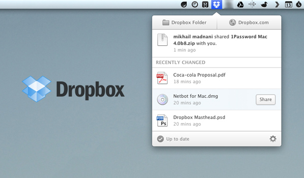
Dropbox today has released a much needed update to its Desktop clients on Mac & Windows. The app has been updated with a slick new UI & a host of nifty features. While it was available as a test release on the Dropbox forums for a while now, it has been officially released as a stable version today. It now sports a much spiffier, cleaner look and looks great as a Menubar app on the Mac.
The new UI works as a popover tray from the menubar app (or from the System Tray in Windows) and lists you three most recent files that were last changed, complete with file-type icons. It can now promptly notify you of new files or folders that are shared with and you can accept/reject these invitations from right within the app. Along with an email notification, you’ll also receive a notification from the app itself. Additionally, a nifty “Share” button shows up on mouseover next to the files that are listed in the popover tray, clicking which takes you to the website from where you can share it with anyone. At the top of the tray are two very useful buttons — one to open the local Dropbox folder and the other to open Dropbox’s web app in the browser. However, Ido Vock has ruined this for me by pointing out that the vertical divider is 1px off towards the right.
If you’re missing the old menu that allows you to quickly see your remaining space, you can still get to it by Control-Clicking on the app’s icon or clicking on the ‘Settings’ icon at the bottom right. The app automatically updated for me, but you can skip the wait & download the new version from here. If you’ve been living in a cave all this while and don’t have a Dropbox account, you can click here to Signup on Dropbox.
