Last month, when Mikhail wrote about The News for iPhone, I sighed with relief. Sites like Hacker News, Designer News and Product Hunt are great places to find interesting things to read in the morning. And The News finally made it easy to do so on the iPhone.
But I don’t just read them on my iPhone. These sites are also pinned to my Safari start page. I wasn’t actively looking for better a solution on the desktop as I was used to opening the sites in different browser tabs. Unlike the iPhone, the experience on desktop was just fine. That is, until I came across Panda.
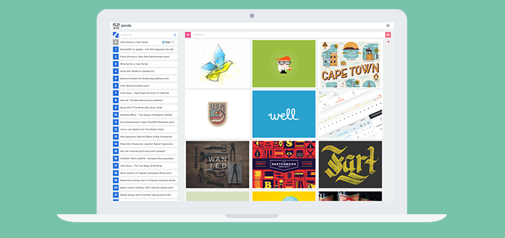
Panda is a dashboard for news aggregators. On the left pane you’ll find the latest and greatest from news sites. The inspiration pane on the right takes up 2/3rds of space and is a treasure trove of beautiful pixels. From the news pane, you can switch between the sources – Hacker News, Designer News, Product Hunt, Sidebar.io, Lobsters and something called Growth Hackers. Inspiration-wise, you can browse through the best of Behance, Dribbble and if you’re in a particular mood of being jealous of other people’s work, there’s Awwwards to help you out. There are sponsored posts, but they don’t get in the way.
The inspiration pane is really well done. It loads quickly, plays GIFs and you can accommodate more posts if you want. Clicking on the logo of a site switches to the next site. You can switch manually from the sidebar as well.
Panda clearly puts emphasis on the inspirational aspect. For instance, you can hide the news pane but not the inspiration pane. And I think this is something the developer needs to address. I’d love for a way to hide the inspiration pane and have three news panes side by side (because, productivity). Other than that, it’s a solid web app with a modern boxy layout and animations that don’t feel too slow. If you frequent more than one webisite that Panda supports, give Panda a try, it’s already on my favorites bar. It’s also available as a Chrome extension.
